Tuesday, January 21, 2014
Eye Tracking: How Users' Eyes Move Across Websites
Monday, January 7, 2013
Four Quick Tips For Better Infographic Design
1. Create A Central Focal PointThe whole idea behind an infographic is to get your information across visually in a quick and easy way. You can’t achieve this if you have a messy, scattered design. Be careful that you don’t turn your infographic into an overwhelming mess that’s impossible to follow. One easy way to avoid that mistake is to have a central focal point (one major graphic element) that attracts the eye and makes the information easy to follow.
2. Keep It SimpleYour audience shouldn’t have to work hard to understand your infographic. That’s why I suggest you avoid the use of legends that force the reader to go back and forth between the information and the legend to understand what’s going on.
3. Create Something Different
If you want to capture the attention of your audience, you need to show them something they haven’t seen before. A lot of infographics share the same basic design – pie chart, bar graph, etc. Try to come up with something new. Avoid being generic and unimaginative. Find a unique visual that corresponds with the information you’re trying to deliver in a smart, creative way.
4. Tell A Story Visually
Thursday, November 17, 2011
Who Is It?: Who's Using Geosocial And Location-Based Services?
Thursday, September 1, 2011
Game Changer: How Social Media Is Altering The Advertising Landscape
Friday, August 19, 2011
Twitter Psychology 101: An Explanation Of Tweeting Behavior

Tuesday, August 16, 2011
Weird Science: Even In Social Media, Timing Is Everything
Thursday, June 23, 2011
Everything You Wanted To Know About Twitter...But Were Afraid To Ask
Tuesday, June 21, 2011
Minute Man: Every 60 Seconds On The Web
Search engine Google serves more that 694,445 queries.
Wednesday, May 25, 2011
The Evolution Of Spam: A Timeline Of The World's Most Hated Messages

Friday, April 8, 2011
The Quora Quotient
Wednesday, March 23, 2011
Professional Networking Site LinkedIn Hits 100 Million Member Milestone, Preps For IPO
Interestingly enough, more than 50% of the company's members come from outside the United States, with one-quarter alone based in Europe (20+ million) and the United Kingdom (5+ million). Nearly 10%, or just over 9 million, are in India. Overall, LinkedIn has members in over 200 countries and territories.
The diversity and accelerated growth in membership are impressive, and certainly represent attractive qualities as the company races toward its highly-anticipated initial public offering (IPO) in 2012. Another big sign of growth? LinkedIn started off 2011 with nearly 1,000 full-time employees located all around the globe, up from around 500 at the beginning of 2010.
To commemorate the membership milestone, LinkedIn produced the following infographic which details interesting membership figures and demographics. Check it out by clicking on the image for a larger view:
Keep your eye on LinkedIn over the next 12 months as it prepares to go public. The company has been introducing features and services left and right for companies and individual professionals, and it promises even more to come. And as Facebook continues to focus more on consumers than businesses, LinkedIn may become the de facto social media outlet for companies of all sizes.
Wednesday, March 16, 2011
The Evolution And History Of Social Media: Another Timeline
Beginning with the introduction of the very first social networks, Friendster and MySpace, to the worldwide successes of Facebook, social media marketing campaigns, and Twitter-using celebrities and professional athletes, this amazing infographic from Edelman Digital offers some fascinating statistics and a stunning pictorial of the social media domain and the people in it. Check it out:
Friday, March 11, 2011
The CMO's Guide To The Social Landscape
And this scenario is often found with social media, which leaves many senior executives scratching their heads, particularly about its utility, revenue generation, brand awareness increase ability, return on investment, and the list goes on and on. Typically, they know they should have some sort of program, but they're not sure how to structure it, fund it, or manage it. Much has been written about how to obtain buy-in on these initiatives from the C-suite, so I won't cover that ground again here.
However, what I will present today is one of the most comprehensive guides I've ever seen that spells out, in very clear terms, exactly which social media platforms should be used to create certain marketing outcomes. For the C-suite, it doesn't get any better than this.
Check out this handy guide, entitled "The CMO's Guide to the Social Landscape," and developed by CMO.com and SEO firm 97th Floor, have created the chart below showing which social networks are best to achieve various organizational, customer relationship management (CRM) and marketing goals. How useful are Facebook and Twitter for SEO purposes? Can Flickr actually drive Website traffic? Is LinkedIn useful for customer communications? If dealing with these questions are part of your day-to-day responsibilities, then you'll definitely want to check this out and then save it.
Make sure to click on the image to view this amazing infographic in PDF format, and then add this to your resource folder. We did!
Monday, February 14, 2011
Cupid ♥ Social Media: The Latest Valentine's Day Stats
And so it goes in the social media space. With the explosion of social media sites worldwide, and with users frequently discussing the status of their relationships (for better or for worse) openly on these forums, the social media realm provides some unique insights into the nature of today's relationships. In addition, it also yields several interesting perspectives on how social media enhances, or detracts from, Valentine's Day plans and gift-giving.
As explained in this story yesterday in Mashable, a recent study of 400 Facebook and MySpace users by Lab 42 offers a solid overview of how Americans perceive their relationships, use social media to describe them, and summarize their Valentine's Day plans. It's all laid out in this intriguing infographic, which may be clicked to reveal a larger view:
The story astutely points out of telling findings. For example, 16% of singles have their current relationship status on Facebook listed as “dating,” “engaged” or “married.” However, no married respondents called themselves “single.” A staggering 88% would rather receive a Valentine's Day gift at home, which we find funny because our two decades of experience in the workplace has been just the opposite. Why? People like to receive their gifts at work to flaunt them in front of their co-workers. And probably the most compelling result is that 41% of the users polled claimed they said "I love you" to their significant other in three months or less. This figure goes up to 63% when factoring in a timeframe of six months or less. Really?
In any case, whatever your status is, have an enjoyable Valentine's Day, and we hope you're spending it with someone special. If for some reason you're not currently in a relationship, then make sure to treat yourself in some way. You deserve it!
Tuesday, January 4, 2011
The Social Media Version Of The Mood Ring
A waste of time, you think? Perhaps not. The research revealed that Americans are happiest in the morning and late evening, and most depressed on Thursday afternoons. Interestingly enough, Americans are happiest on Sunday mornings, the study found. Some of these variations can be explained by the three-hour difference between the West and East Coasts; essentially, this means that the West Coast is happy three hours after East Coast residents. A detailed analysis of the study can be reviewed in this post on Business Insider.
To summarize their results, Harvard and Northeastern researchers created the following time-lapse video showing a typical day's tweeting activity, with red being grumpy and green being happy:
And the insights don't end there. According to the researchers, several interesting trends can be observed in the data on both daily and weekly bases. Check out the following graphs, as well as the cartogram illustrating state-by-state variations:
Daily Variations

Weekly Variations

Cartogram

For additional insight on Twitter usage statistics, please check out our pre-Christmas post, entitled "The User Demographics And Usage Patterns Of Twitter," which discusses the prestigious Pew Research Center’s Internet & American Life Project's findings that only 8% of American adults that are online are now using Twitter, among other interesting data.
Monday, December 13, 2010
The User Demographics And Usage Patterns Of Twitter
According to the findings of a recent study conducted by the prestigious Pew Research Center’s Internet & American Life Project, only 8% of American adults that are online are now using Twitter. This statistic was widely reported last week by many mainstream media outlets and technology blogs when the study's results were first released, but a deeper analysis of the research reveals some additional..and truly surprising...insights.
Interestingly enough, in the 10-year lifespan of the Pew Internet Project, this is the first time the organization has surveyed users about a single, company-specific online application or activity because the Project's mission is to look generally at online usage patterns rather than at specific brands or technologies.
First, let's take a look at Twitter's current demographics:
As this chart shows, groups notable for their relatively high levels of Twitter use are:
~ Young adults: Internet users ages 18-29 are significantly more likely to use Twitter than older adults.
~ African-Americans and Latinos: Minority Internet users are more than twice as likely to use Twitter as are white Internet users.
~ Urbanites: Urban residents are roughly twice as likely to use Twitter as rural dwellers.
~ Women and the college-educated are also slightly more likely than average to use the service.
Secondly, how are all these groups ACTUALLY utilizing Twitter? Check out this great chart which compares the frequency of different activities. The service is primarily used for posting personal updates, although 62% post work updates and just over 50% of all Twitter users share news stories and communicate directly with others users via direct message:
So what does all this mean? Even with all the hype and buzz surrounding Twitter as a micro-blogging platform, and its willingness to be embraced by techies, politicos, professional athletes, recording artists, film and TV actors, and many other individuals, the service has much room for improvement in attracting an ethnically-diverse range of users and compelling them to utilize Twitter in a broader spectrum of ways.
Given the success of and reception to this study, I'm sure we will see follow-up surveys from Pew which will attempt to update these findings. Stay tuned...particularly as Twitter's usage and popularity continue to evolve.
Monday, December 6, 2010
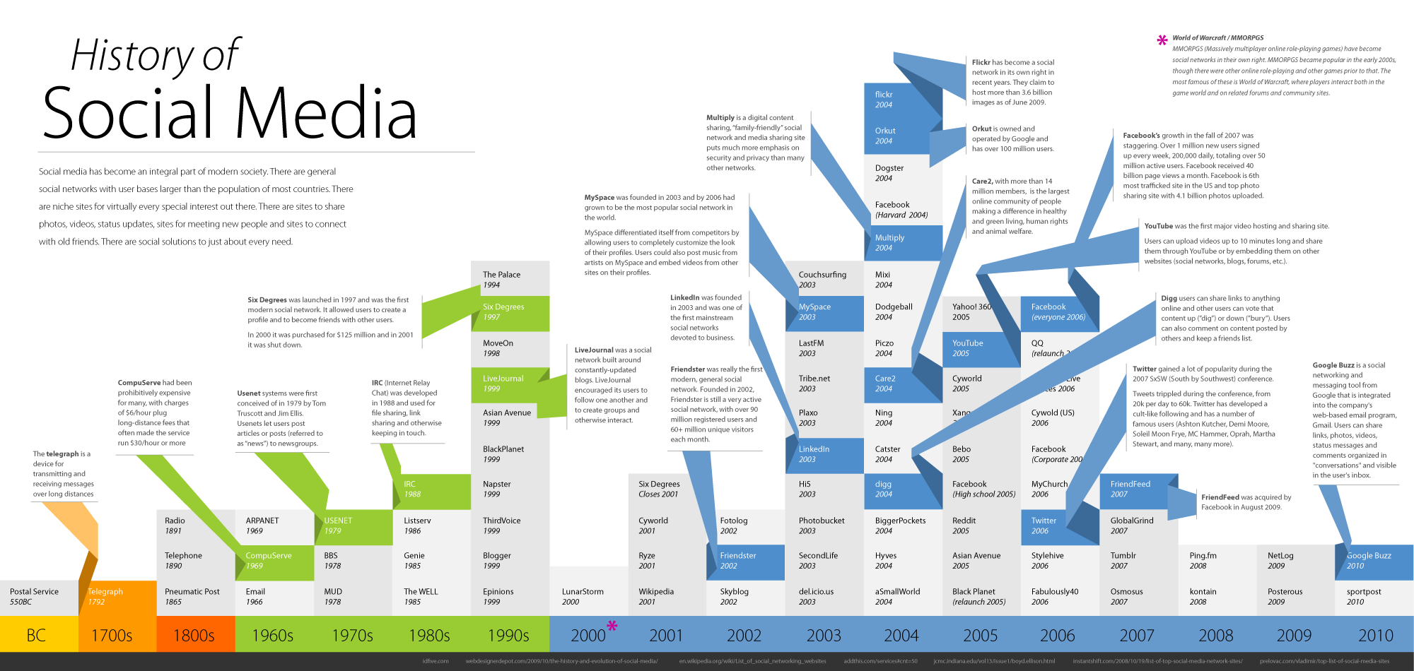
The History Of Social Media: A Stunning Visual Timeline
According to Barry Ritholtz on his blog, The Big Picture, we all know social media has become an integral part of modern society. It's as common nowadays as, well, breathing and blinking. Currently, there are popular social networks with user bases larger than the populations of most countries. In addition, there are niche sites for virually every special interest in existence. And there are countless sites to share photos, videos, and status updates, as well as online destinations for new people and connecting with family members and old friends. In the final analysis, there are social solutions for just about every communication need in the world.
So, at this point, now is as good a time as any to take a look at the history of social media...rendered in the following amazing and informative infographic with a comprehensive global history of the medium. You can click on the image for a larger, more detailed view:
Friday, August 20, 2010
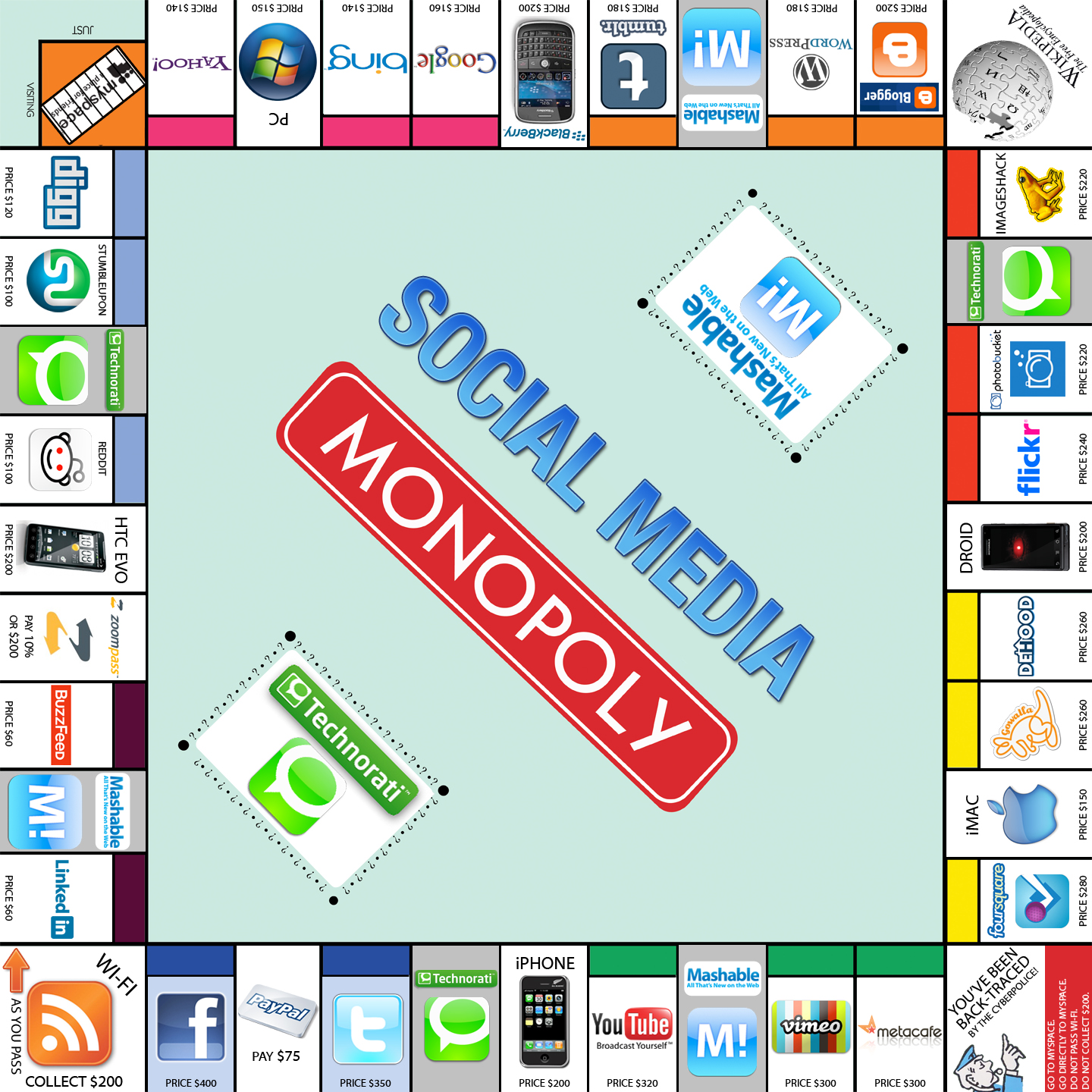
Take A Ride On The Reading: Social Media Monopoly
However, I wonder how she WOULD fare if the social media space were turned into a Monopoly game? I'd love to find out by playing this version of the game, courtesy of Barry Ritholtz's great blog, The Big Picture:
Click on the graphic for a larger, more detailed version; it's worth a closer inspection.
Naturally, Facebook and Twitter are the most expensive properties, taking the place of Broadway and Park Place. Instead, of Chance and Community Chest, this version sports Technorati and Mashable, while the railroads, such as B&O and Reading, have been replaced with key smartphone platforms like Droid and iPhone.