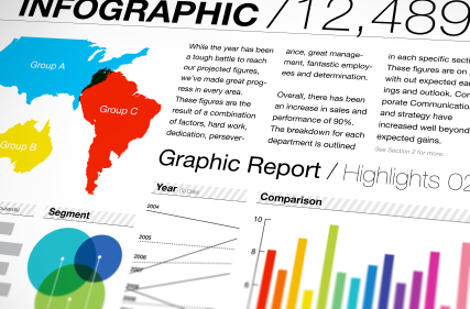
Editor's Note: The following is a guest Marketing Mulligans post written by Mickie Kennedy, founder and president of eReleases, a cost-effective electronic press release distribution service, and a widely-regarded and well-respected PR professional who maintains the company's popular PR Fuel blog. Infographics are all the rage these days; in fact, you'll find a bunch of them here on Marketing Mulligans. However, not all infographics are created equally. Some are awesome, and these present facts and figures in compelling ways. Others...eh...not so much. Here are some fast and easy ways to design outstanding infographics to boost your content marketing efforts.
____________________________________________
Did you know that over 80% of all human learning occurs visually? The simple truth is that most people are visual learners. Visual aids help to grab their attention, educate them, and increase their retention of new material.

That’s why infographics are such a powerful tool, and that’s why in the past I’ve talked about infographics can be a great format for your press release.
However, just because you put some information in the visual form of an infographic doesn’t mean that you’ll automatically get through to your audience. Design matters. If you can nail the design of your infographic, you’ll be able to grab readers’ attention, educate them, inspire them to share your infographic, etc. But it all comes down to getting the design right.
Here are 4 simple tips to keep in mind when designing your infographic.
1. Create A Central Focal PointThe whole idea behind an infographic is to get your information across visually in a quick and easy way. You can’t achieve this if you have a messy, scattered design. Be careful that you don’t turn your infographic into an overwhelming mess that’s impossible to follow. One easy way to avoid that mistake is to have a central focal point (one major graphic element) that attracts the eye and makes the information easy to follow.
2. Keep It SimpleYour audience shouldn’t have to work hard to understand your infographic. That’s why I suggest you avoid the use of legends that force the reader to go back and forth between the information and the legend to understand what’s going on.
3. Create Something Different
If you want to capture the attention of your audience, you need to show them something they haven’t seen before. A lot of infographics share the same basic design – pie chart, bar graph, etc. Try to come up with something new. Avoid being generic and unimaginative. Find a unique visual that corresponds with the information you’re trying to deliver in a smart, creative way.
4. Tell A Story Visually
When you get right down to it, infographics are tools for telling a story. And with infographics, you shouldn’t rely just on the words/data to tell your story; you should let your design be the storyteller. Someone should be able to quickly look at the visuals of your piece and understand the point you’re trying to convey.
1. Create A Central Focal PointThe whole idea behind an infographic is to get your information across visually in a quick and easy way. You can’t achieve this if you have a messy, scattered design. Be careful that you don’t turn your infographic into an overwhelming mess that’s impossible to follow. One easy way to avoid that mistake is to have a central focal point (one major graphic element) that attracts the eye and makes the information easy to follow.
2. Keep It SimpleYour audience shouldn’t have to work hard to understand your infographic. That’s why I suggest you avoid the use of legends that force the reader to go back and forth between the information and the legend to understand what’s going on.
3. Create Something Different
If you want to capture the attention of your audience, you need to show them something they haven’t seen before. A lot of infographics share the same basic design – pie chart, bar graph, etc. Try to come up with something new. Avoid being generic and unimaginative. Find a unique visual that corresponds with the information you’re trying to deliver in a smart, creative way.
4. Tell A Story Visually
© Copyright 1998-2013 eReleases® Press Release Distribution. All Rights Reserved.


